CHAMPAGNE POETRY
DES 321: Brand Lab
Brand Identity
Brand Identity
Case Study
Process
Process

I collaborated with another student for this mock re-brand of Champagne Poetry, a Portland patisserie that fuses Asian flavors with French pastry techniques and is obsessed with pink.


PROCESS
RESEARCH/STRATEGY
Client
Champagne Poetry is a French Asian fusion patisserie located on SE Hawthorne Boulevard in Portland, Oregon. Champagne Poetry features many elegant pastries, cakes, and other desserts, as well as coffee, tea, and wine. Ultimately, Champagne Poetry serves an elevated experience alongside their artistically crafted pastries and champagne.Brand Attributes
- Mixing traditional French pastry techniques with asian flavors
- Everything is pink
- Femme. Like a brunch stop the morning after girls night out
- Bougie-on-the-weekend
- They get a line on weekend mornings, like a fancy donut shop
- Bad Girl vibes
- Named after a Drake song
- Vibrant colors, bold visuals
What’s Working
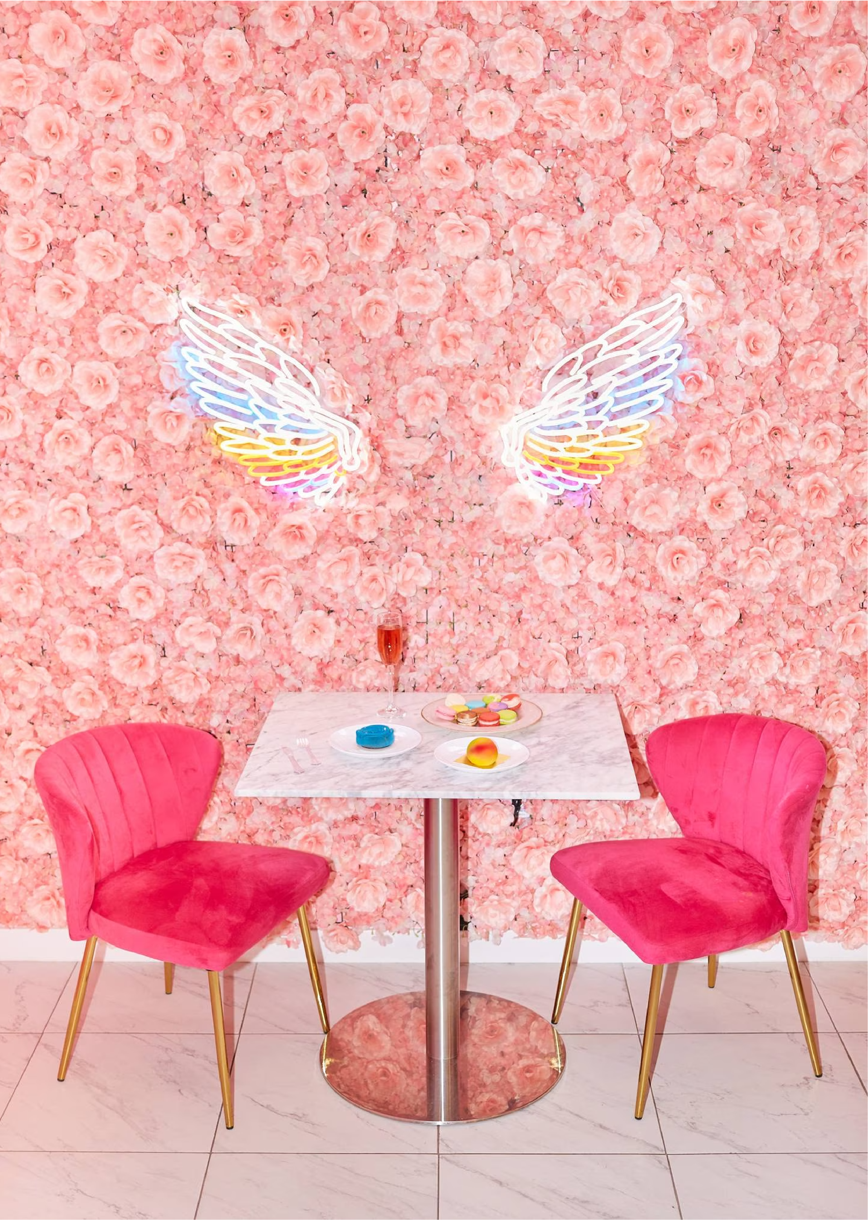
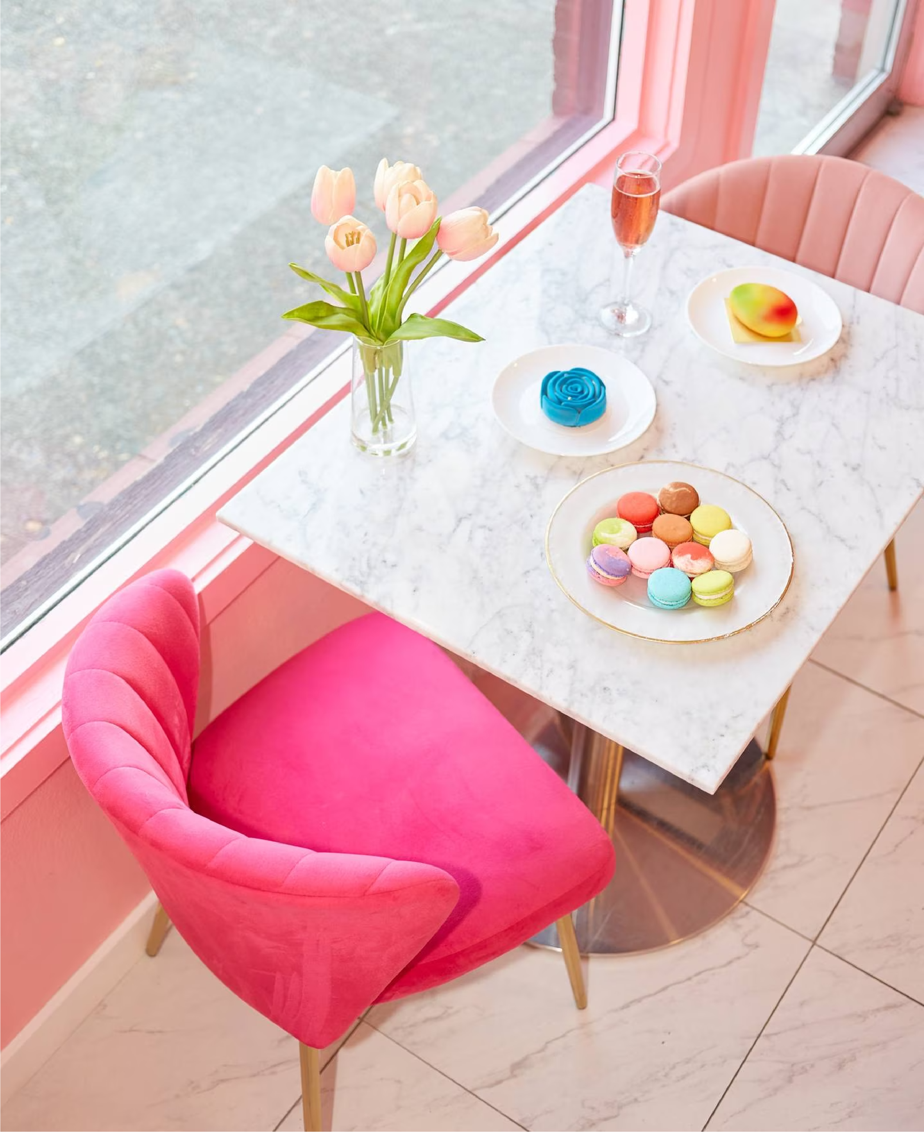
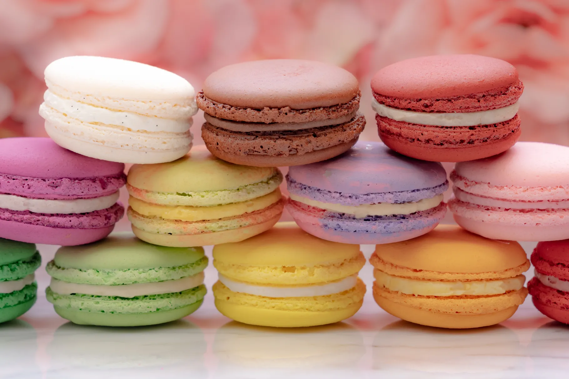
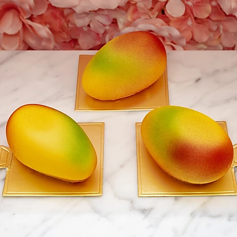
In some ways, the brand has a strong identity—it’s decidedly femme and bougie in a fun way, and it has a unique value proposition, combining French pastry techniques and bright or floral Asian flavors. It communicates it’s energy most effectively in staged photography: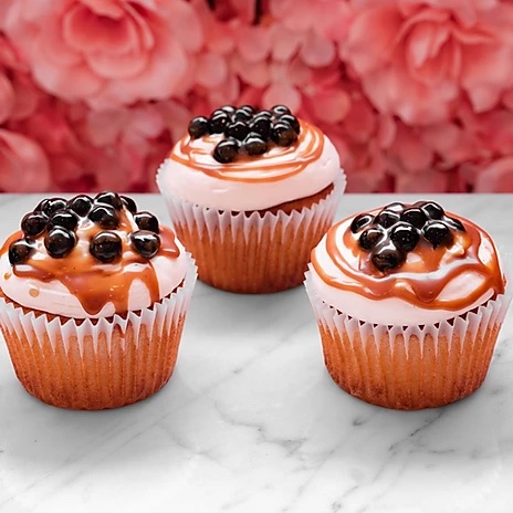

What’s Not
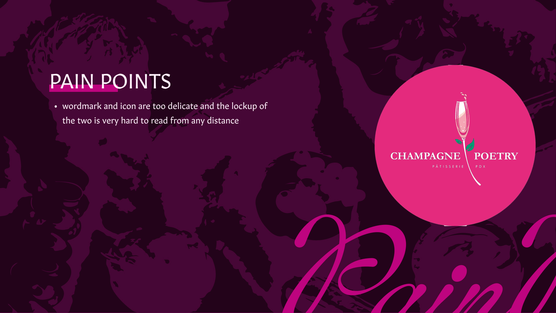
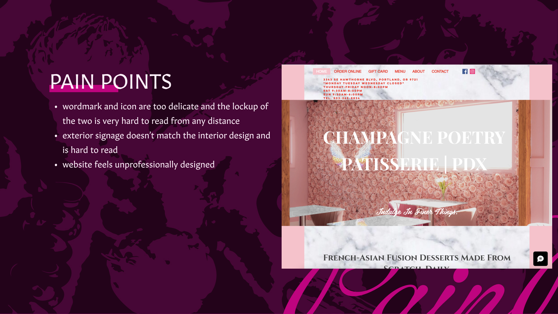
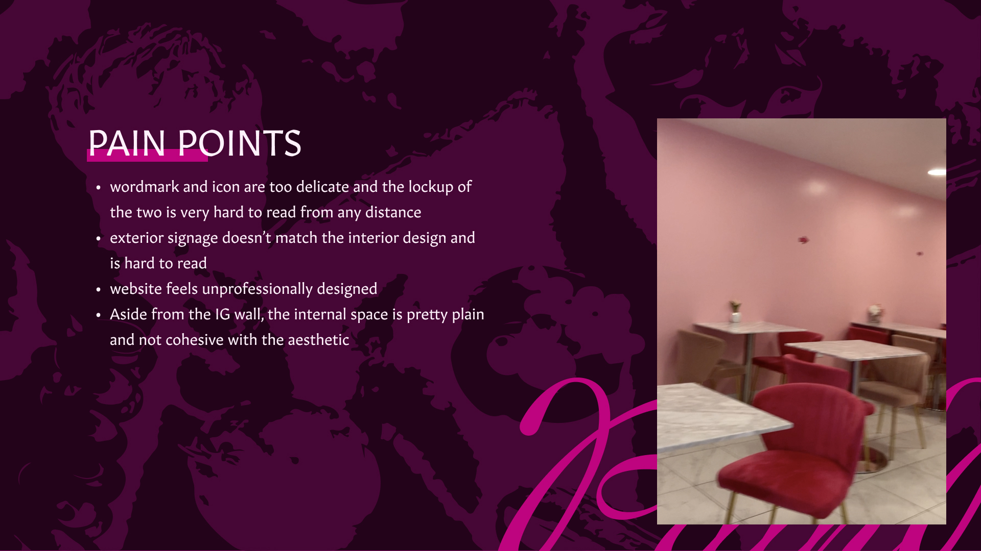
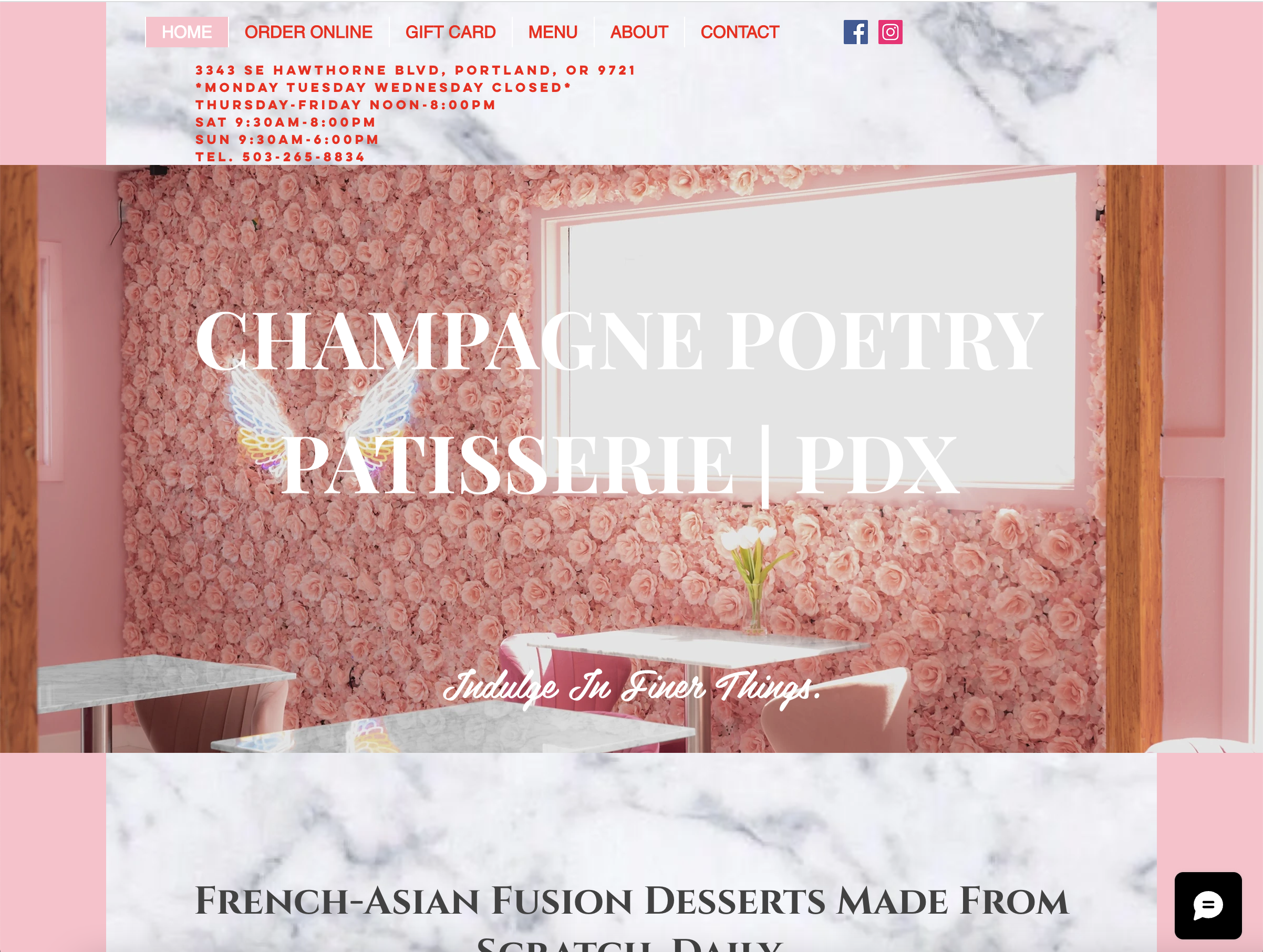
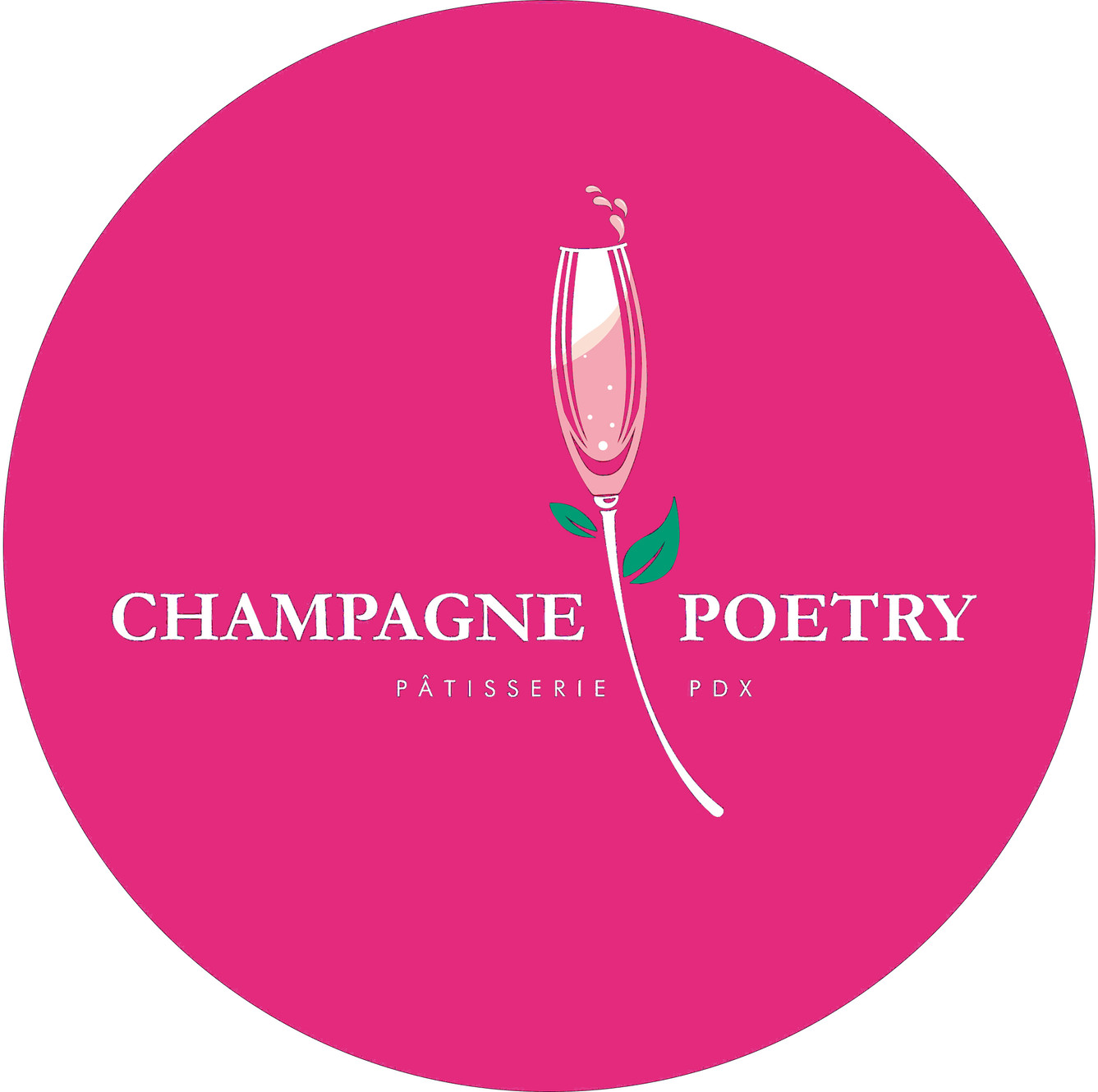
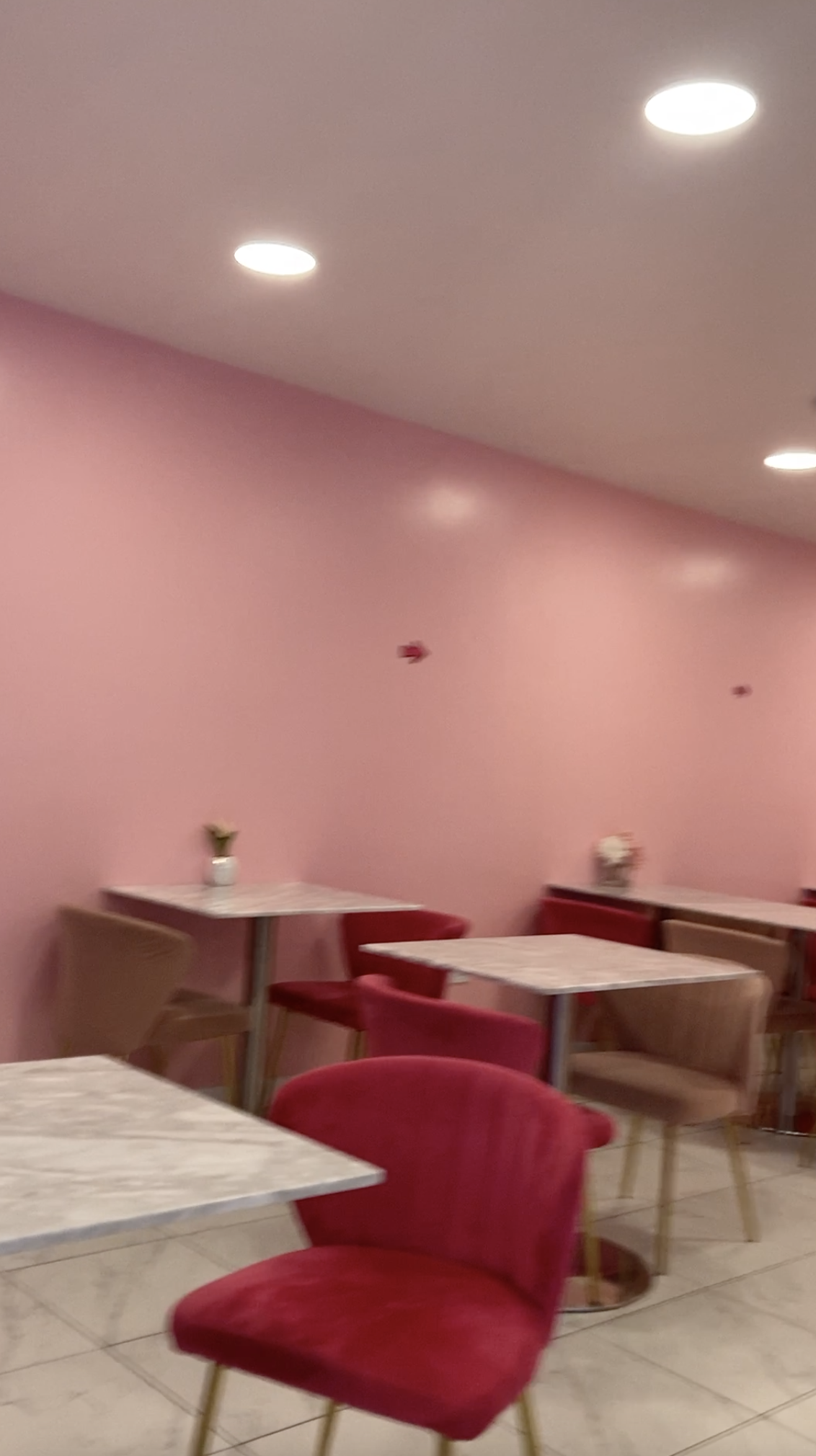
When we visited the patisserie in-person and checked out their website and brand expressions, we were immediately struck with some of the ways that the branding was unsuccessful or inconsistent:- wordmark and icon are too delicate and the lockup of the two is very hard to read from a distance
- exterior signage is almost impossible to read from the street
- website feels unprofessionally designed
- Aside from the IG wall, the internal space is pretty plain and not cohesive with the aesthetic
- Overall disconnect between the existing branding and the quality experience CP wants to offer

Goals
Our overall goal was to make the entire experience of Champagne Poetry match the energy given off in it’s strongest moments:- Create a clear, consistent visual language and apply it to deliverables across digital and physical spaces
- Legibile, impactful external signage to increase foot traffic
- Elevate the inside space, making it match the vibe of the staged photography on IG
- Create a memorable experience of the physical space, from the moment you see the outside sign to the moment you leave
Highlighted Attributes
We homed in on these particular attributes, which we felt tied the energy of the brand to tangible visual and coneptual themes that could be explored in a variety of ways.- edgy
- Femme
- BOLD
- Dark
- Bougie
- Glowing
- Pink
THE REBRAND
Our version of Champagne Poetry is edgier and darker: we went all-in on the bad-girl energy and the fun of being bougie on the weekend. This rebrand feels a lot more like the song it’s named after, and has a clear identity carried through physical and digital expressions giving a cohesive sence of attitude combined with elegance.
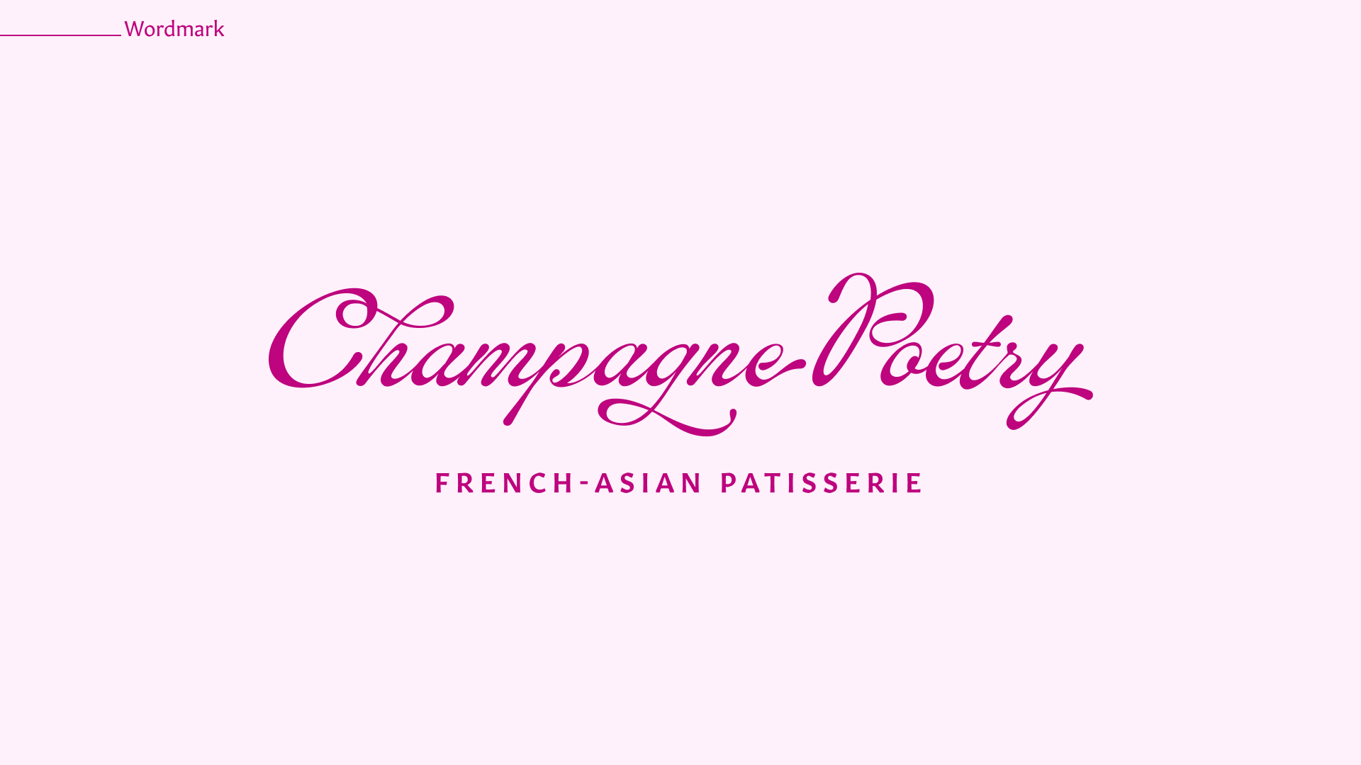
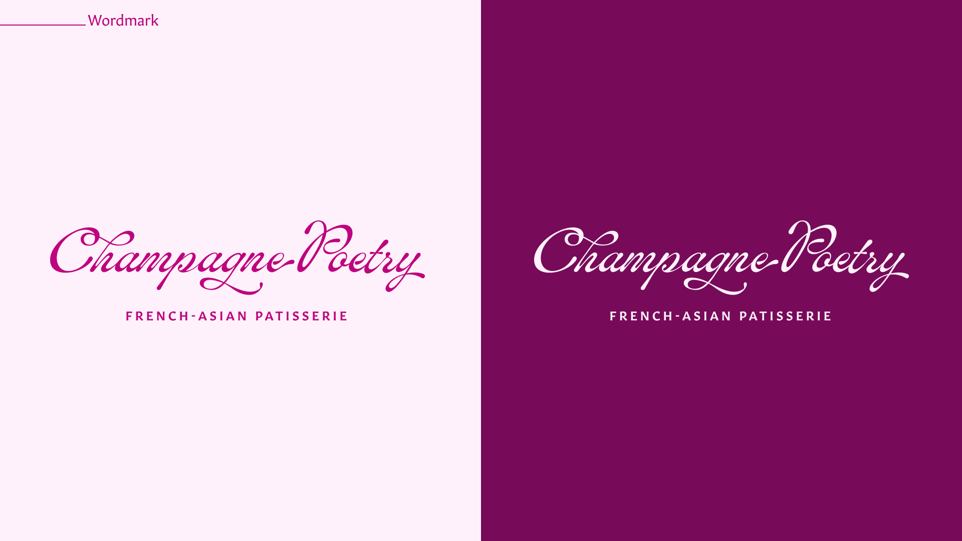
Wordmark *
I created this wordmark to communicate the elegance of Champagne Poetry’s French pastry roots, but used a more contemporary script and custom ligatures to make it stand out from other old-world, script-based wordmarks.

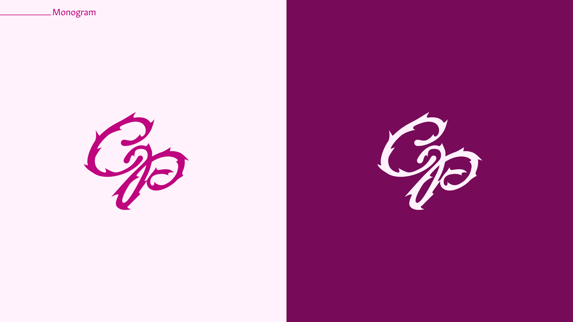
Monogram
My teammate created this monogram, showing the flipside of the elegance: the roses thorn, the attitude that made our rebrand stand out from other teams in the class that chose the same brief.

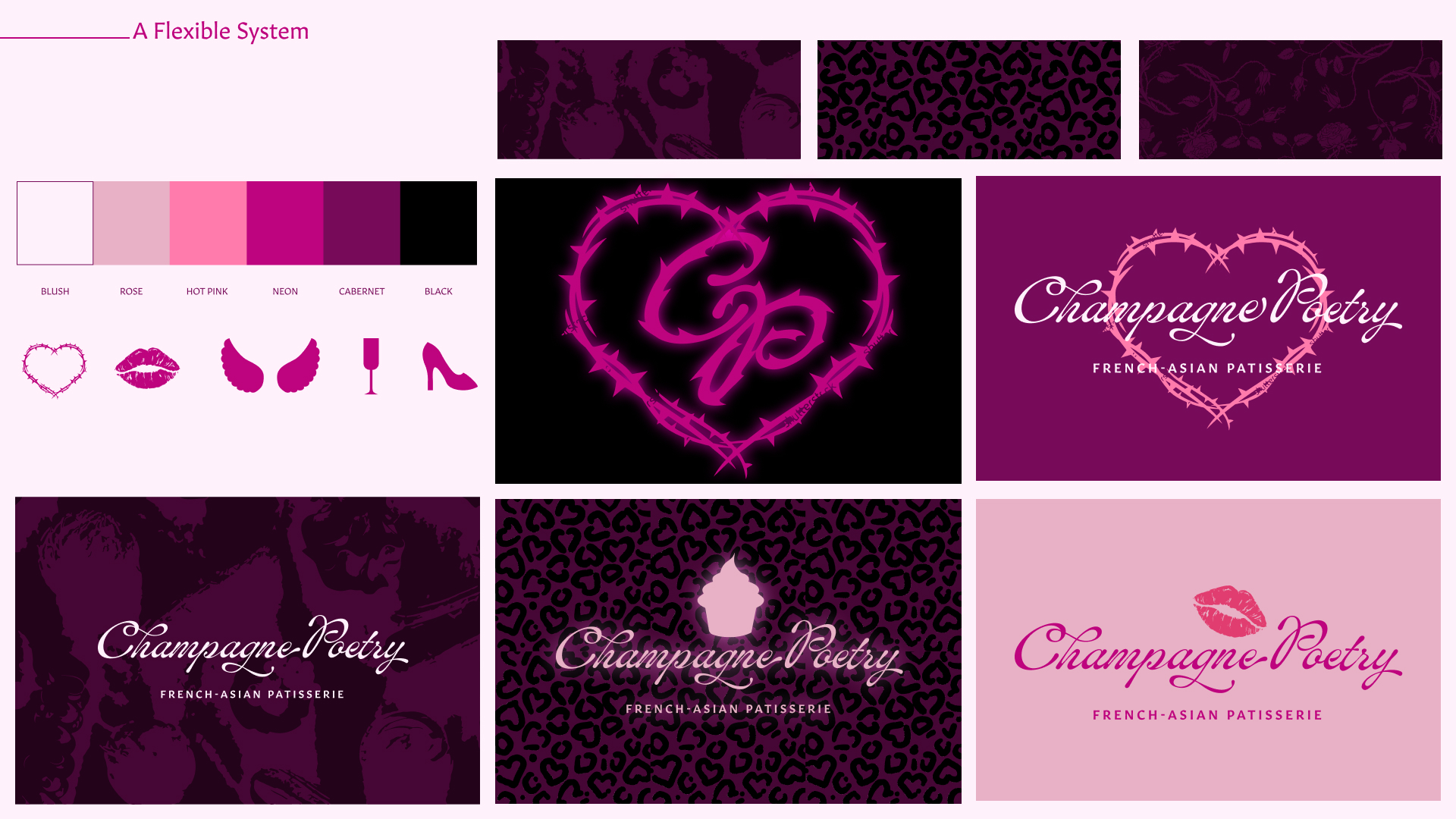
Flexible Design System
One of my favorite contributions to this project is the idea that with a flexible palette of design elements that allows many combinations, designers will be able to tap into different aspects of the brand for different campaigns.For example, you can look at the palette below and imagine which variations would work well for Valentines Day versus “Champagne Poetry After Dark” (a campaign to pull in the dessert crowd for expanded nighttime hours).

Signage
One of the biggest issues we found with CP’s brick and mortart was external signage. I upgraded their presence on the street with a sign that ‘s more eye-catching and immediately communicates the vibe.
Neon Sign
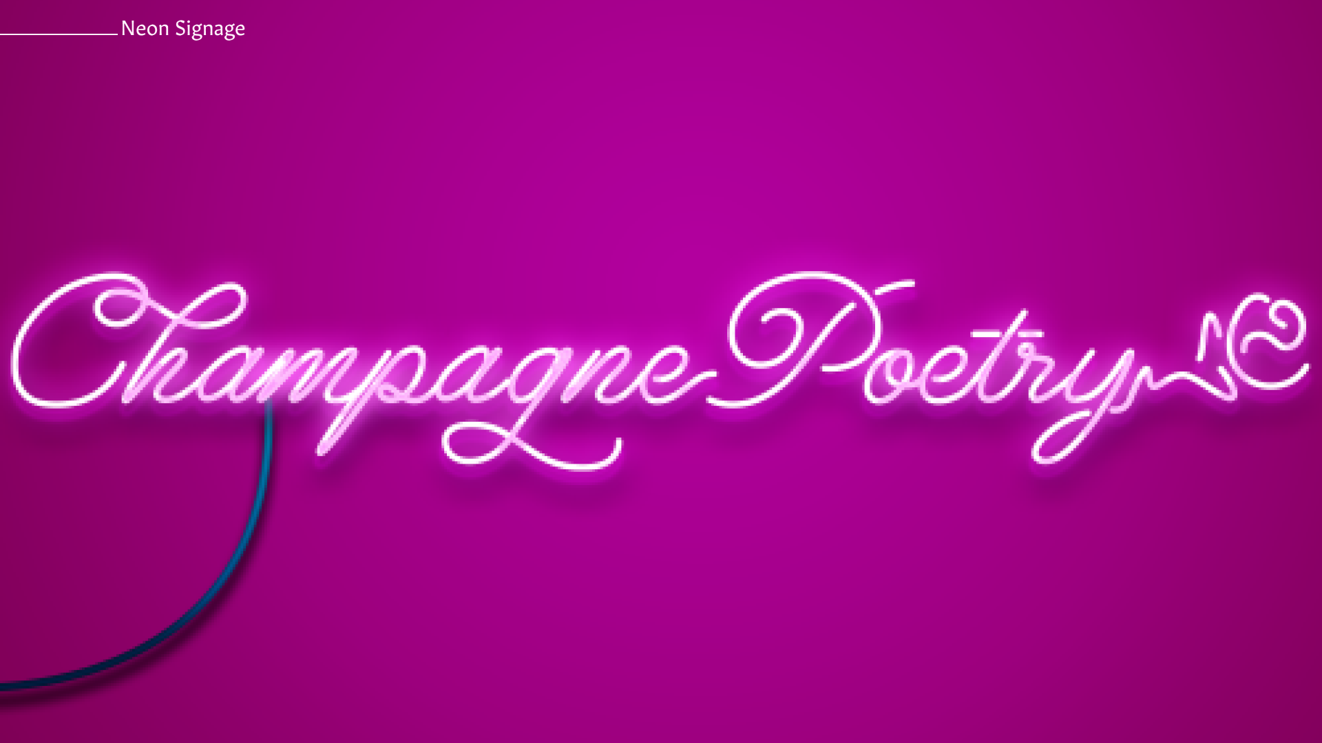
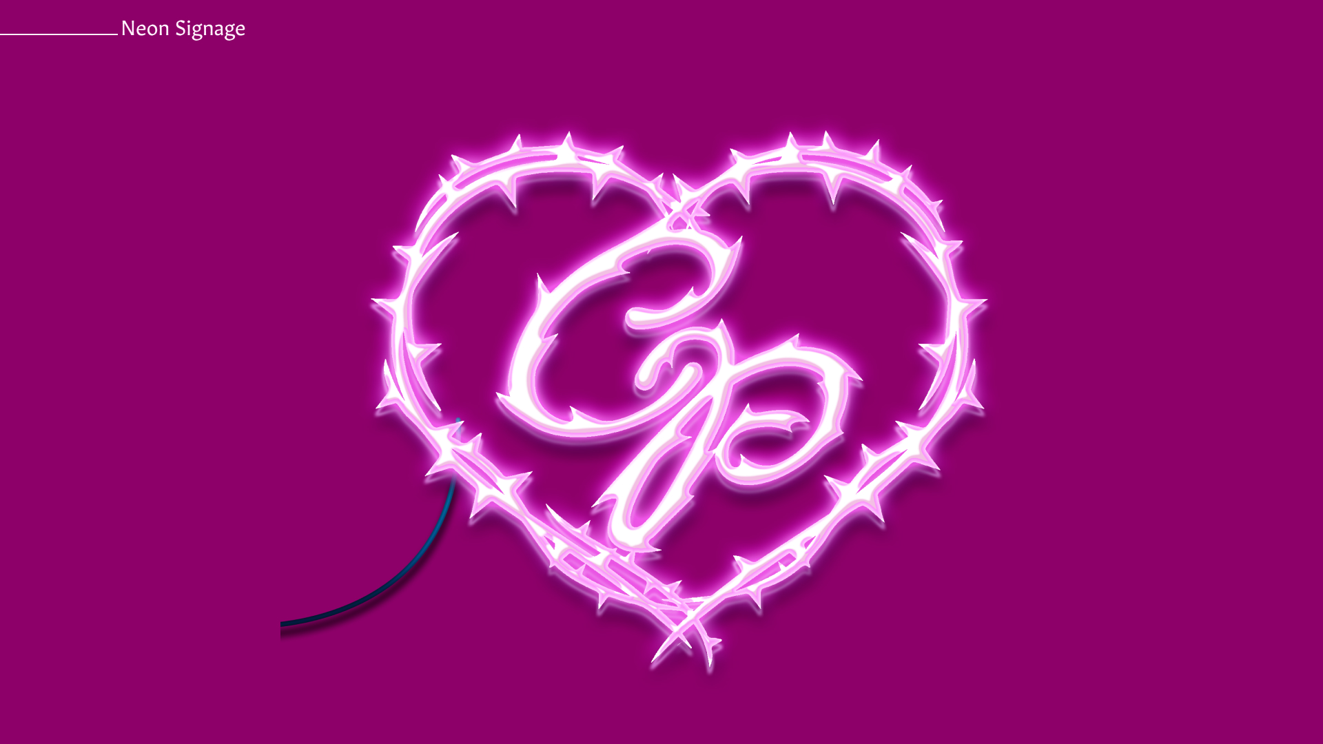
Another instance where the physical space was really lacking in brand expression was the inside walls. It felt more like a mall food court than a high-end experience. This neon sign carries the nightlife-inspired aesthetic through the interior of the patisserie, lending some much-needed flavor to the bare walls.
Packaging
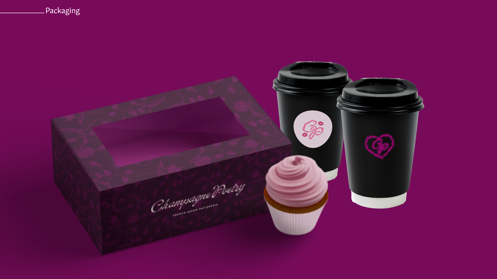
The range of brand expressions we created allowed us to create packaging that balanced elegance with attitude.
Website
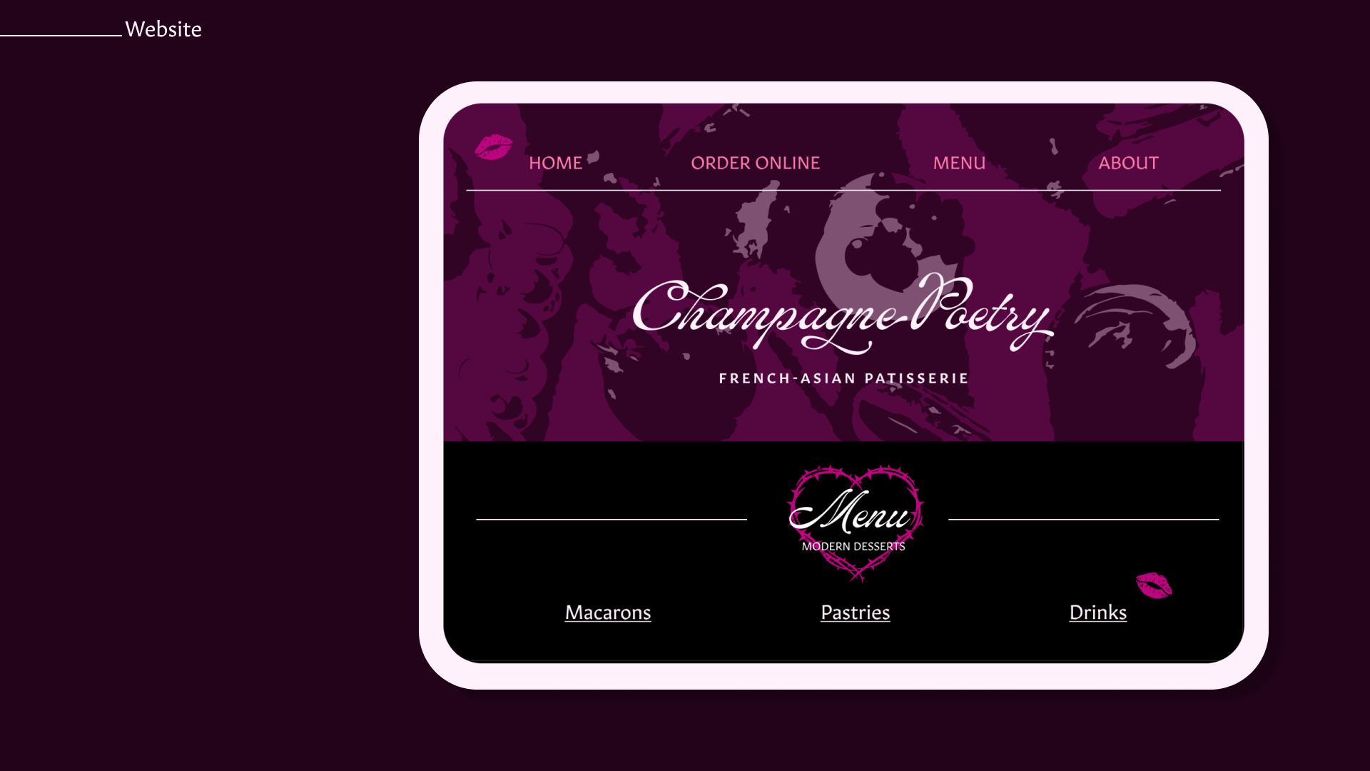
We re-vamped the website with our cohesive brand system, communicating the vibe and making it clear that this is the same brand as the physical space.
BRAND PRESENTATION PDF
Our team was voted as one of the two most succesful rebrands in the class. On the last day of class some of the folks from The Beauty Shop creative agency were kind enough to join our class and give a critique on our presentation.
This is the deck we presented:
This is the deck we presented:
